Back


2018
University of Chicago, Center for Translational Data Science
Founding Product Designer & Researcher
The Gen3 Data Commons is a tool for managing medical data that is supported by the National Institutes of Health (NIH). Researchers are required to upload data and files from their NIH-sponsored projects to the Data Commons, however, the tool has not been widely used due to difficulties in understanding how to create a unique data model for uploading data.
The goal is to make it easy for users submit data, which helped get more data sets and helped researchers use the tool better.
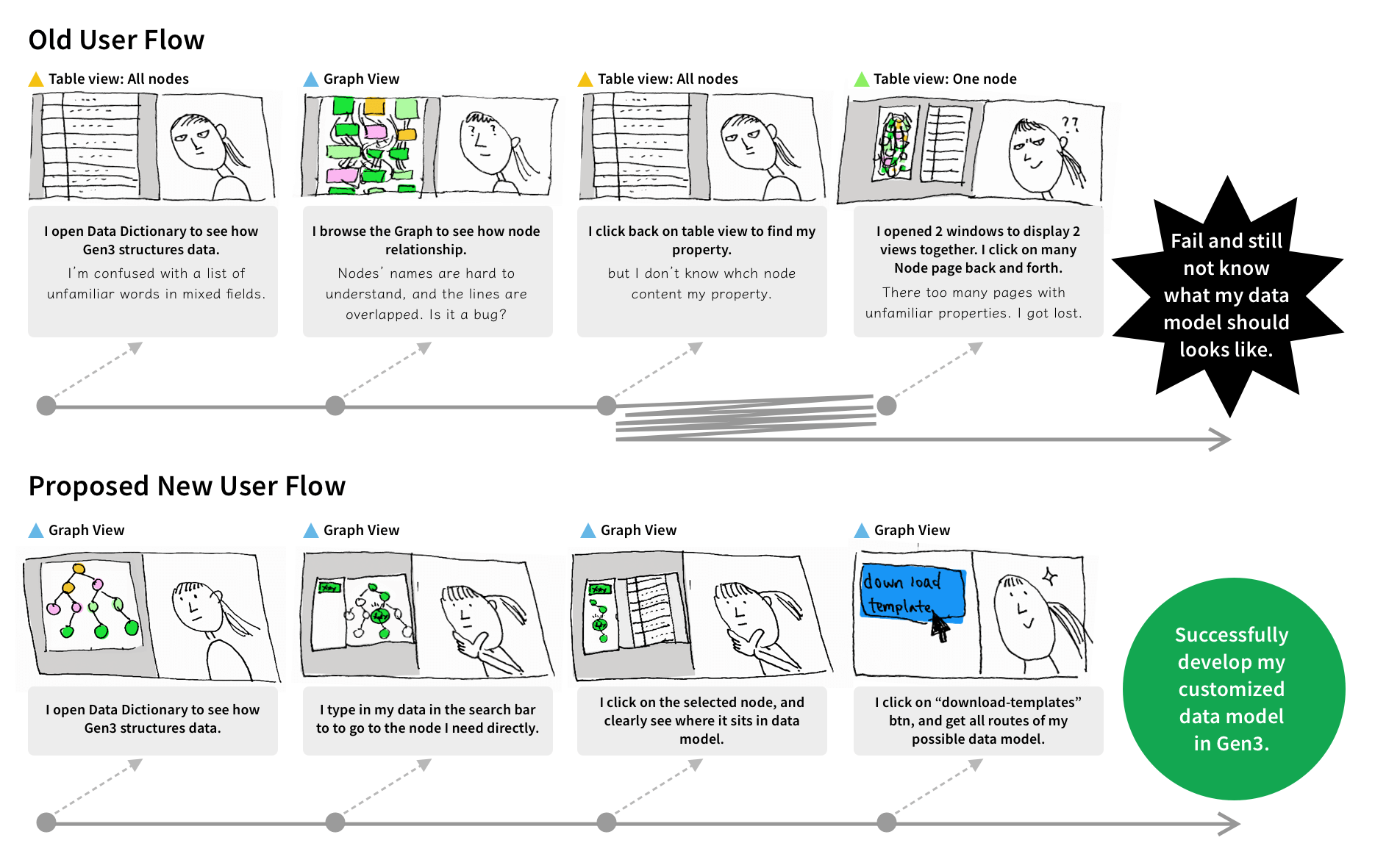
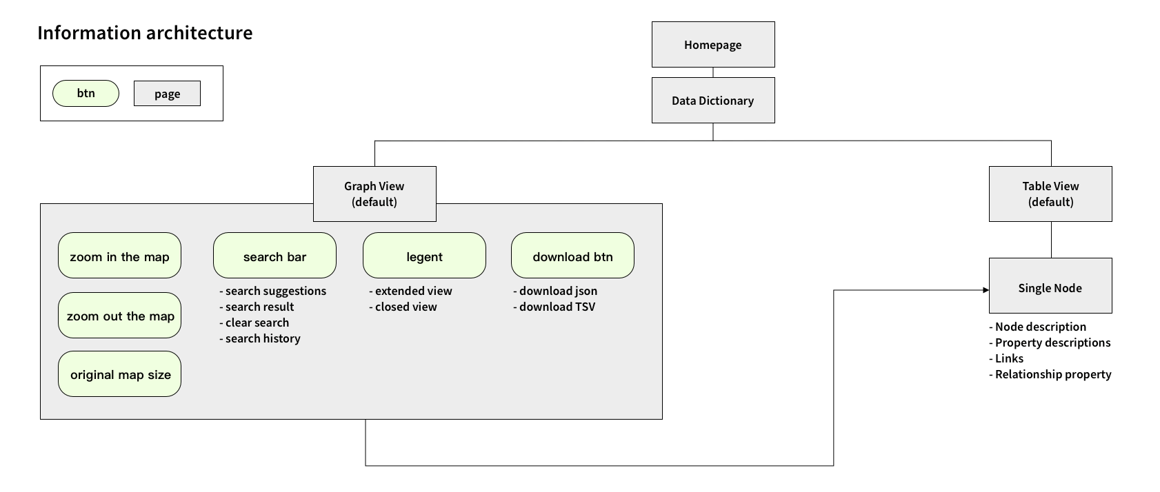
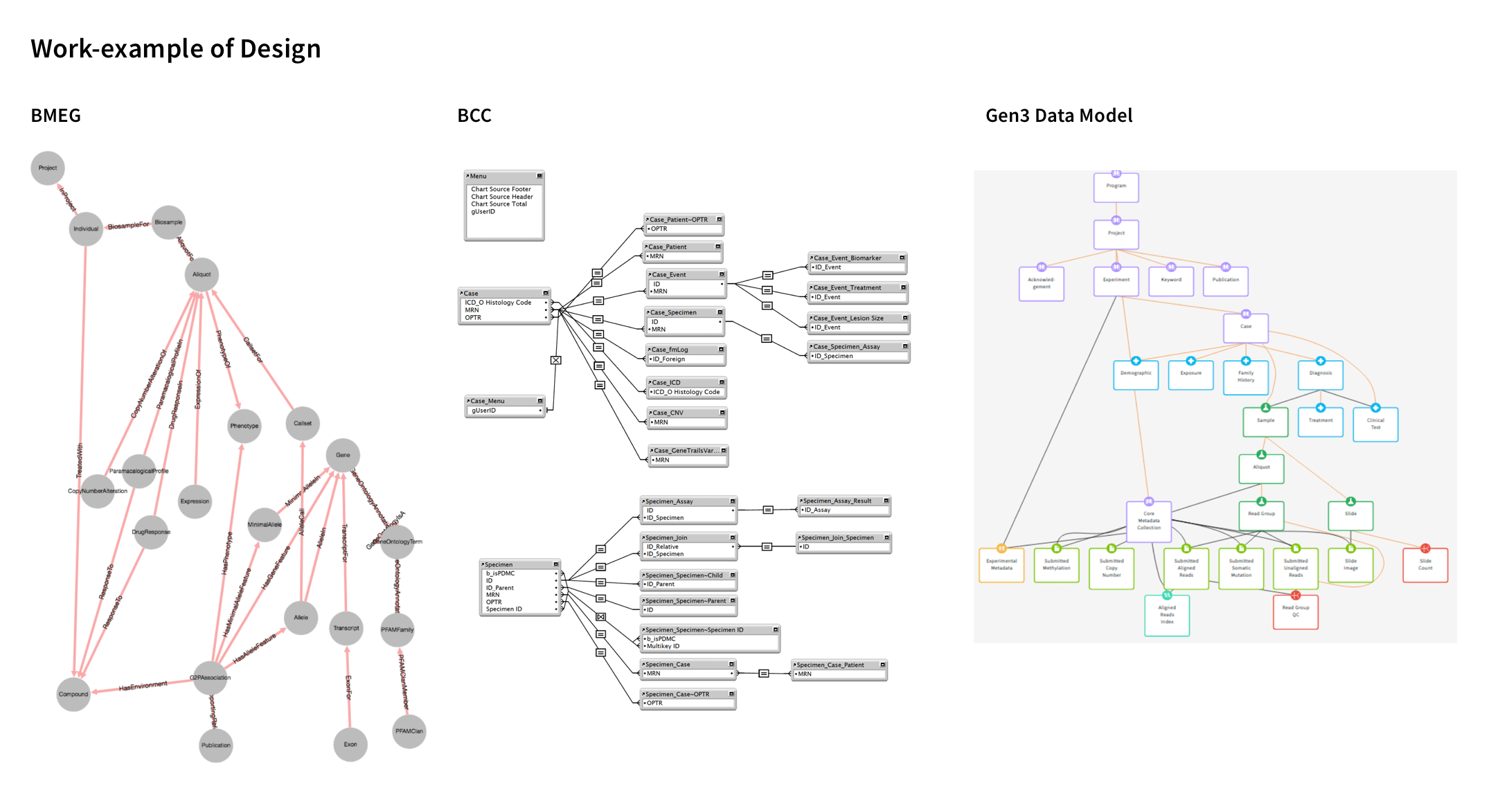
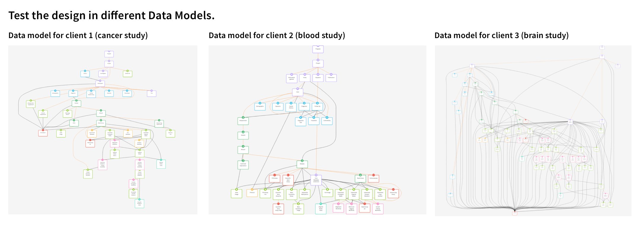
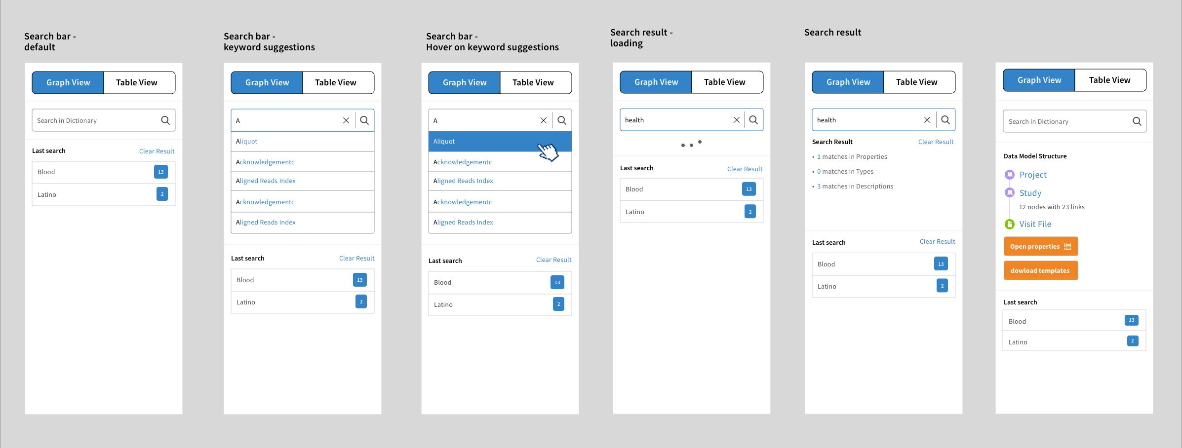
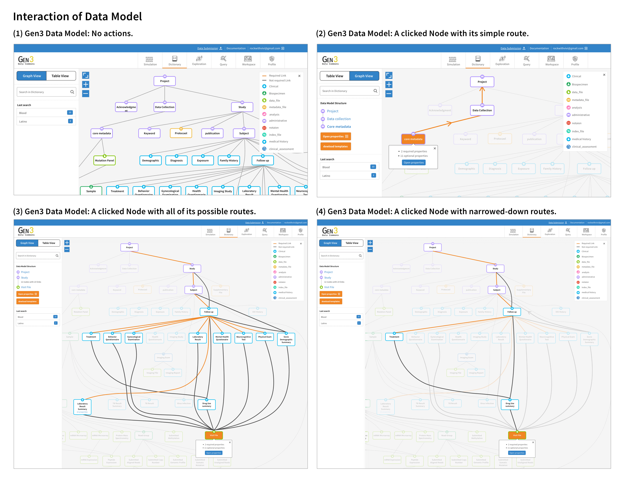
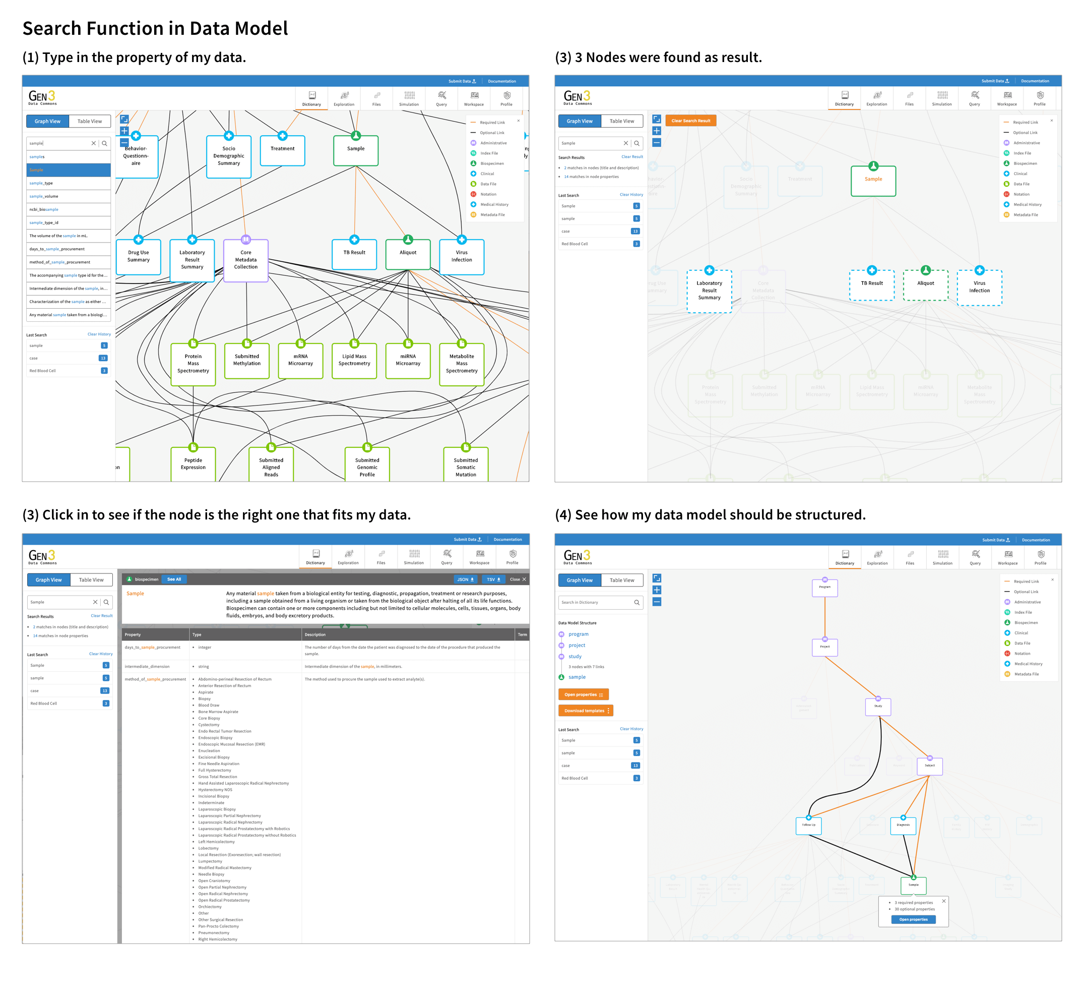
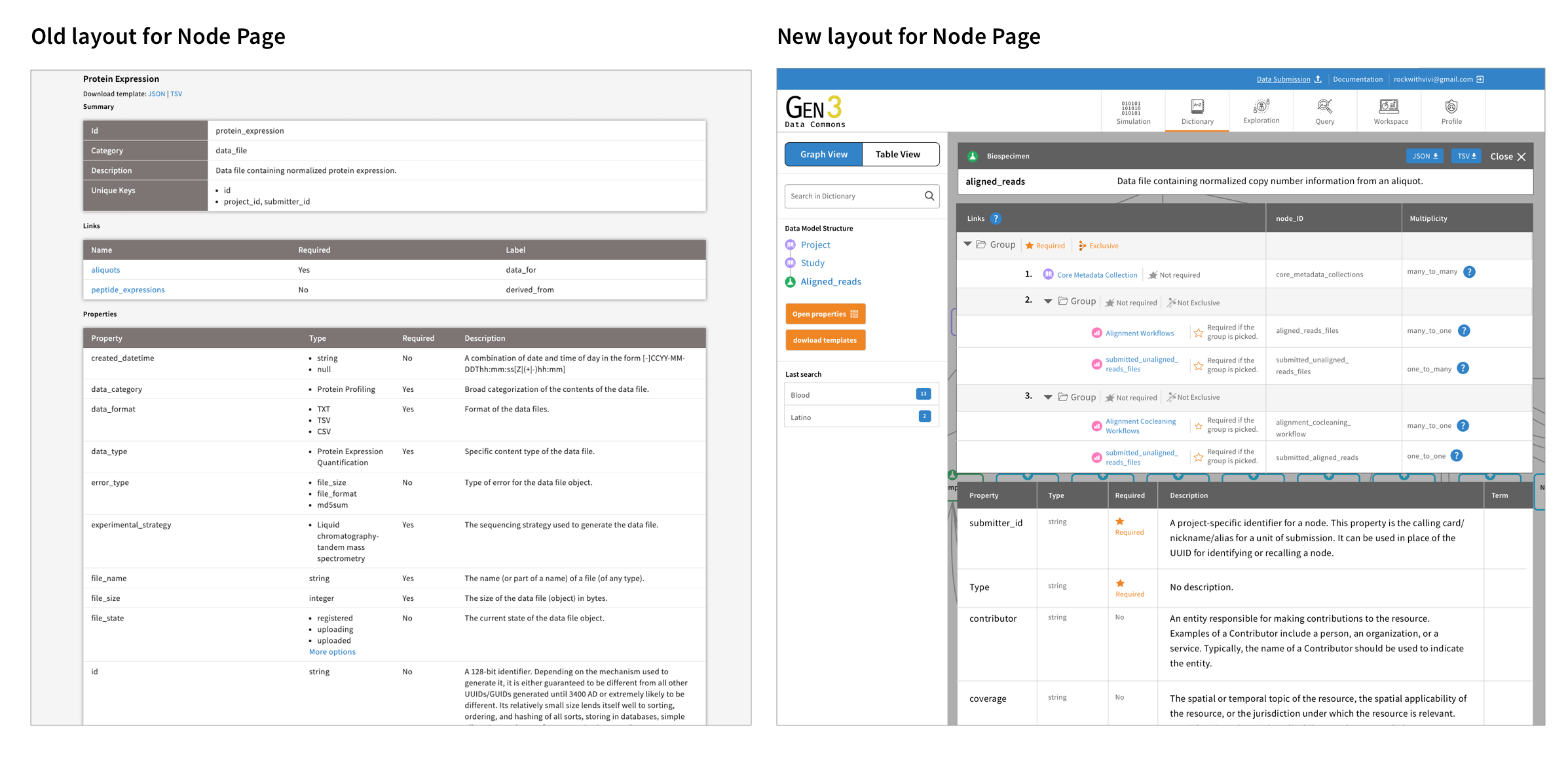
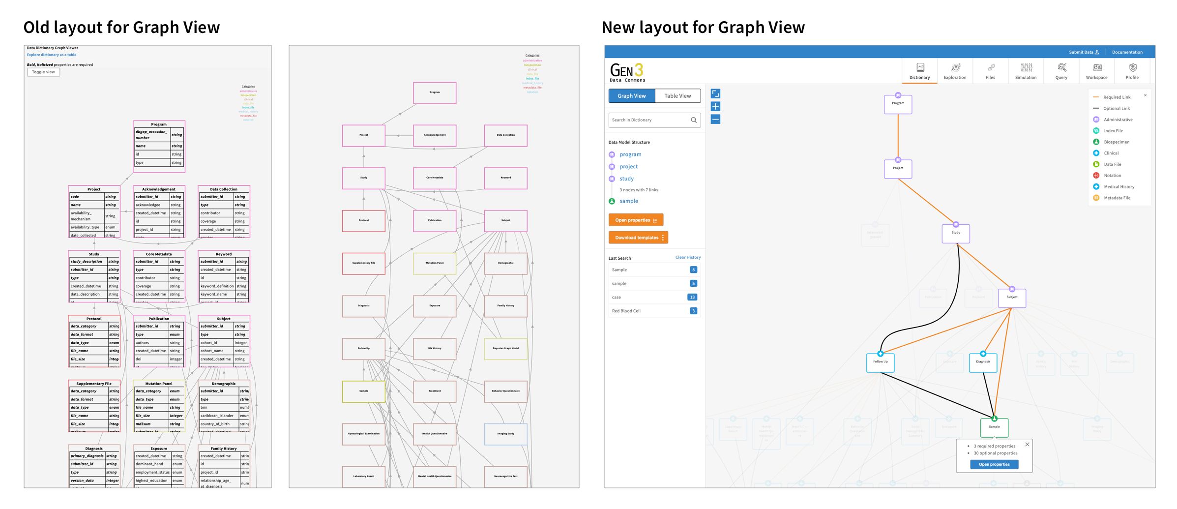
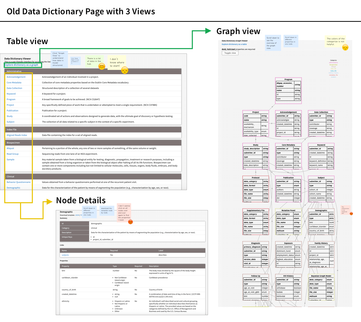
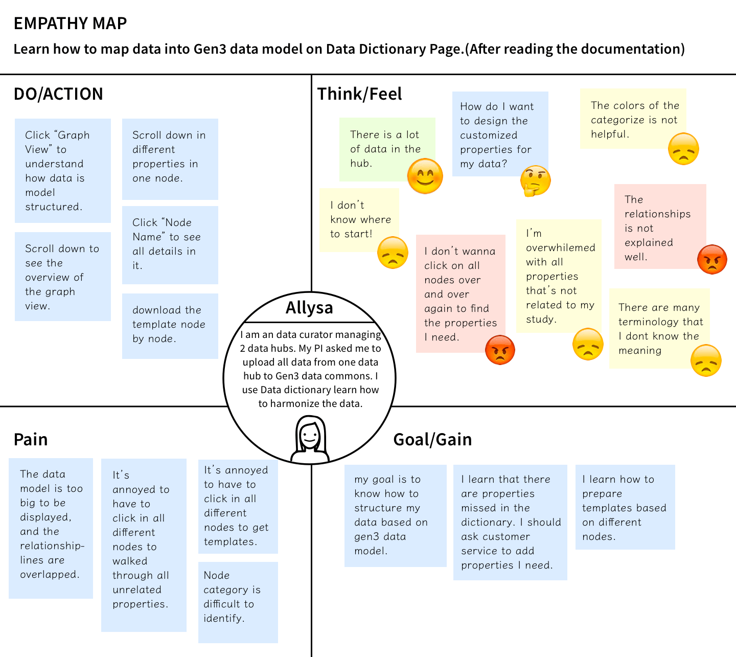
I wanted to make the data dictionary easier to use for people who submit data. I found that there were two main issues: first, the data dictionary only had a table view and did not clearly show how different pieces of information were related. Second, it didn't show the most important information first and there were too many pieces of information that made it hard to use.
As part of my design methodology, I conducted user research by interviewing ten individuals and created a journey map to document the user experience of utilizing the data dictionary to submit data. Furthermore, I actively participated in weekly meetings with the customer success team to provide support for onboarding new users and addressing any reported issues experienced by current users.
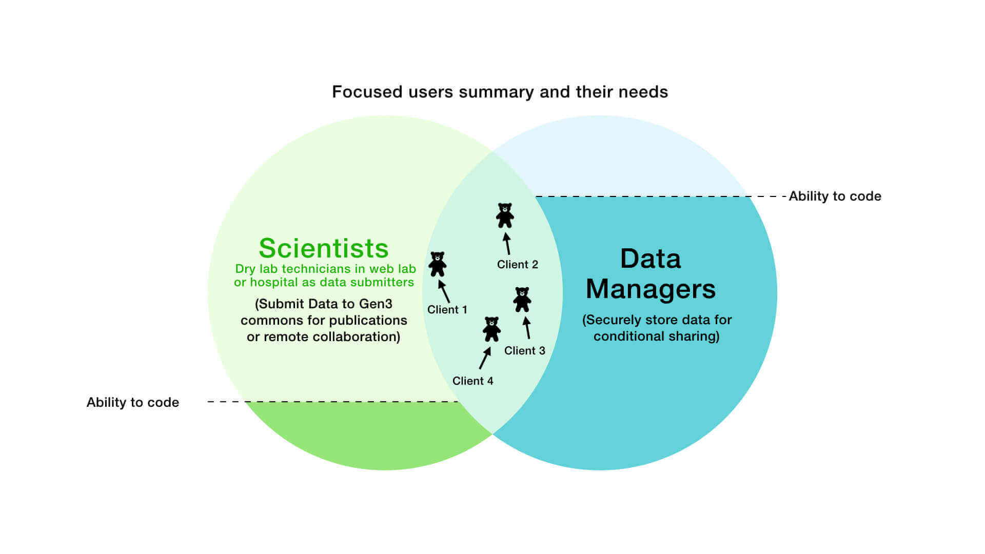
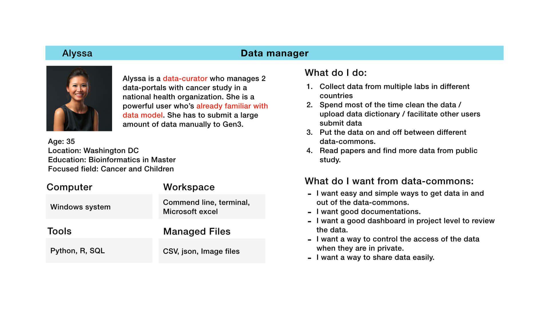
To ensure that the design met the needs of the target user groups, I developed three personas based on their coding abilities and data knowledge, including wet lab technicians, bioinformaticians, and clinical workers. This project prioritized the needs of bioinformaticians with the goal of quickly increasing the amount of data available in the data commons, and the project scope and design expectations were aligned accordingly.
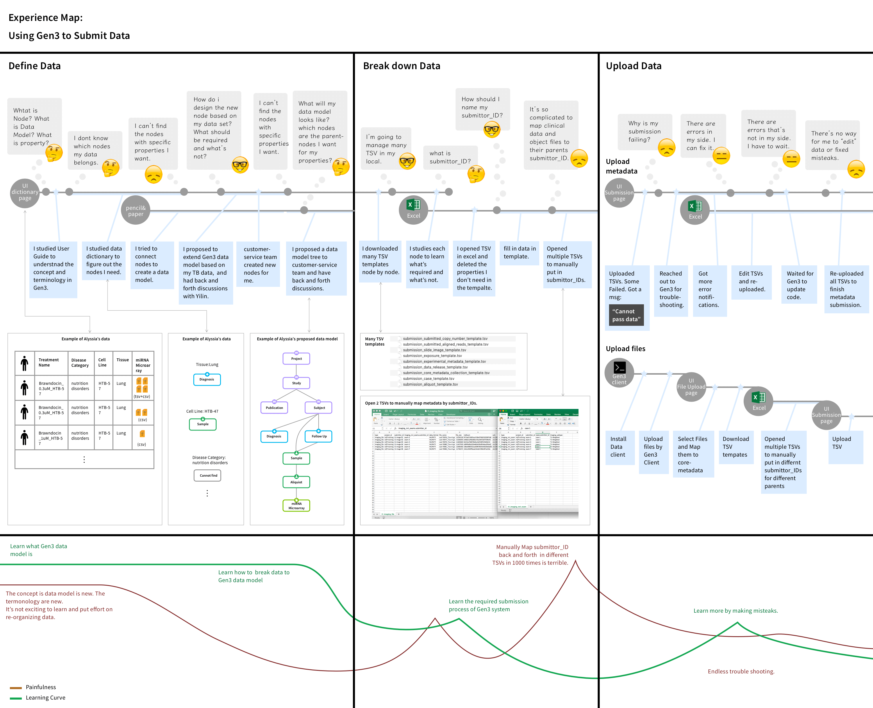
After identifing the primary user pain points, the entire team was assembled to brainstorm potential solutions. After several rounds of discussion, we reached agreement on a design scope:
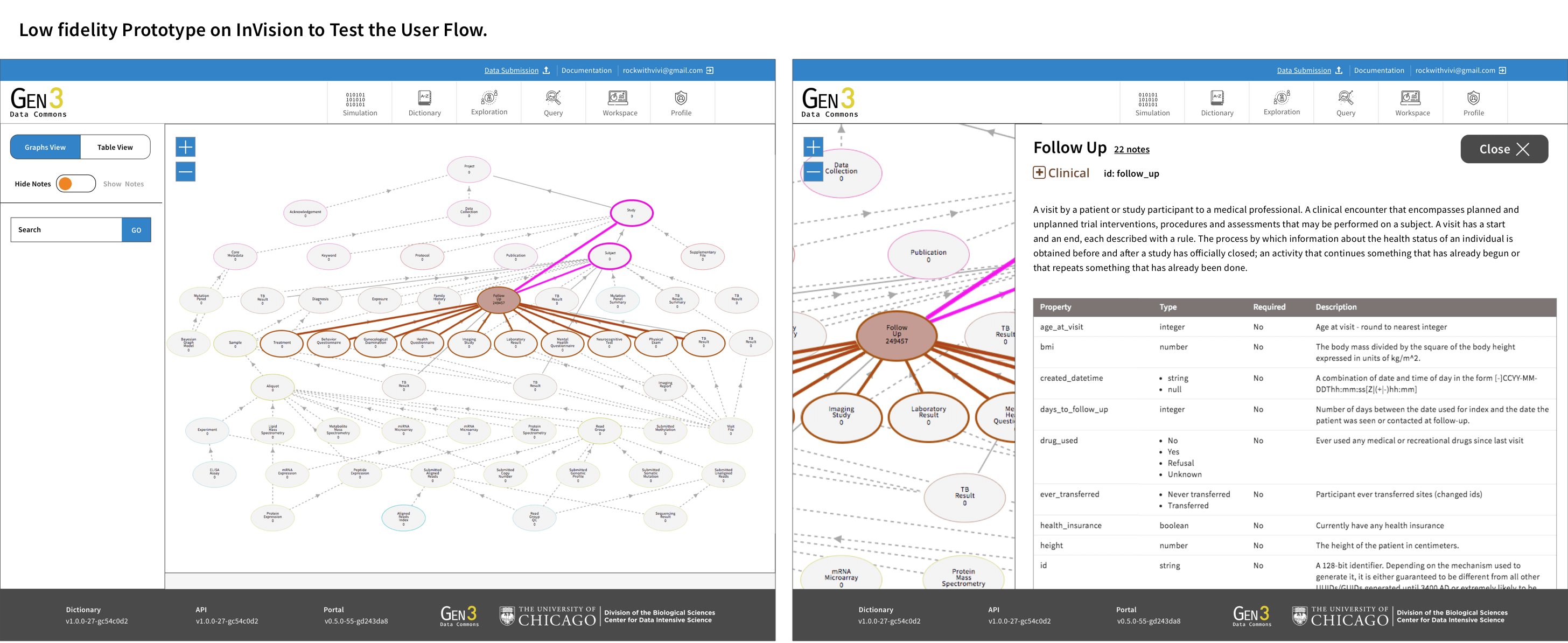
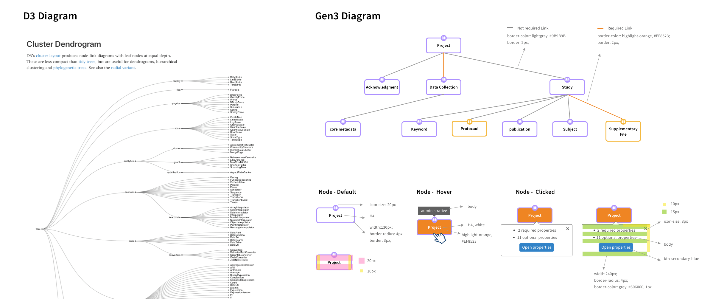
I worked closely with the engineers to explore differnet solutions by quickly creating rough prototypes for them to examine various libraries and continually refined and tested the design during the design and development process. I aimed to present complex information in a clear and organized manner
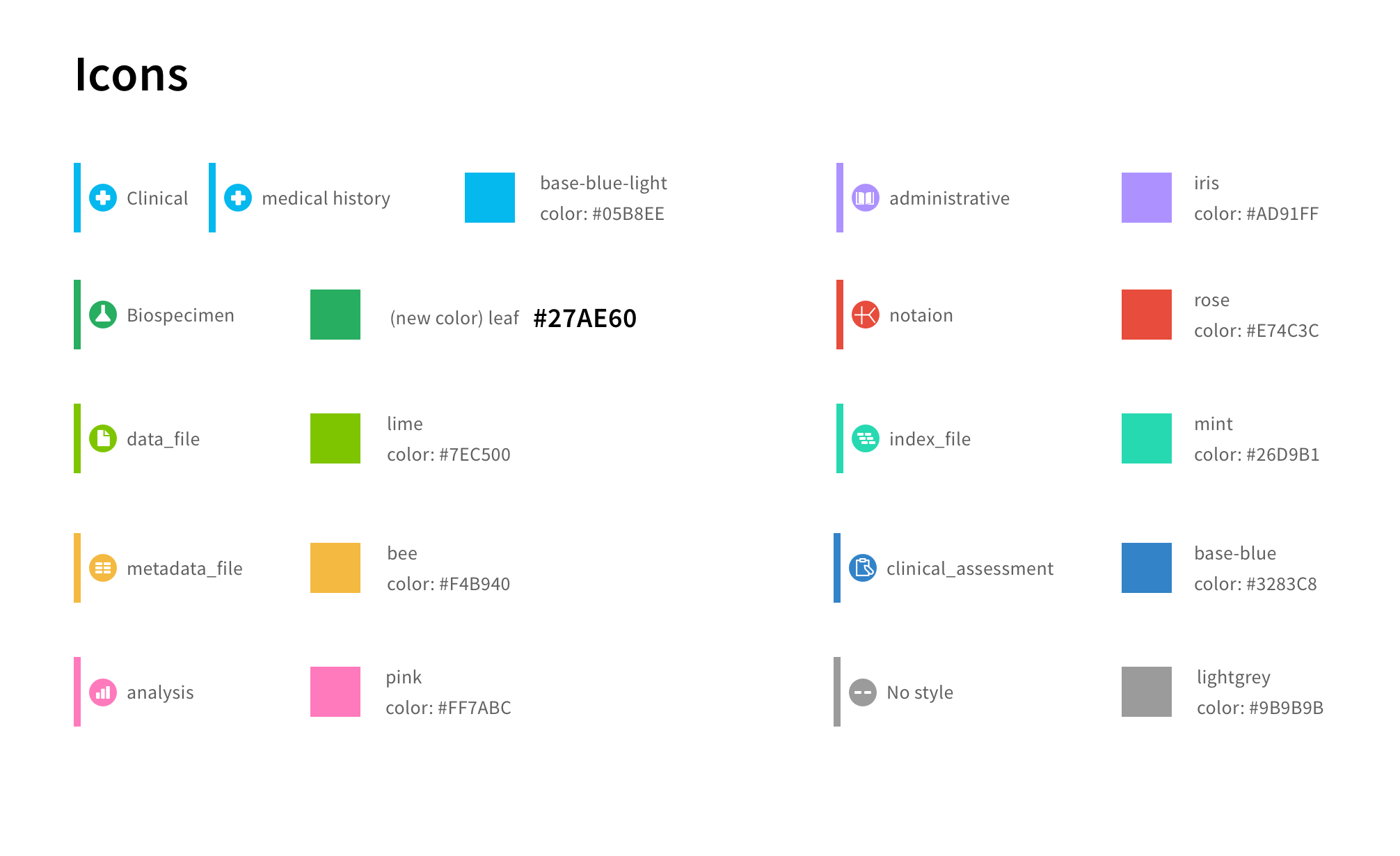
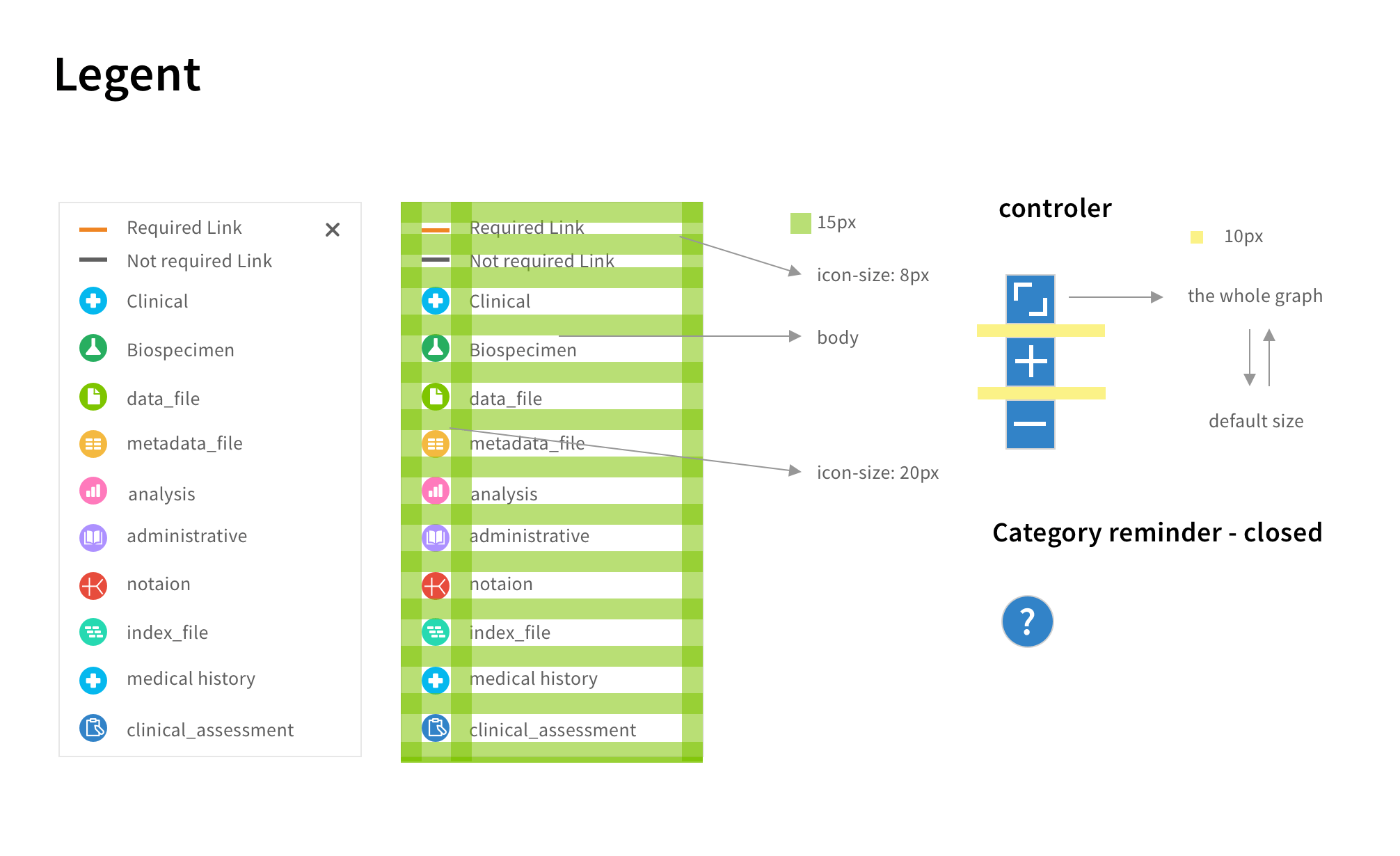
In terms of user interface design, adhering to WCAG (Web Content Accessibility Guidelines) standards was essential for our project.
I also established a design system and created a style guide to collaborate with the developer in creating a UI component library using Storybook. Adhering WCAG (Web Content Accessibility Guidelines) standards and maintaining visual consistency contributes to a positive user experience.